Skylight Guides
Learn how to use Skylight to make your app faster.
Navigating Your App
App Dashboard
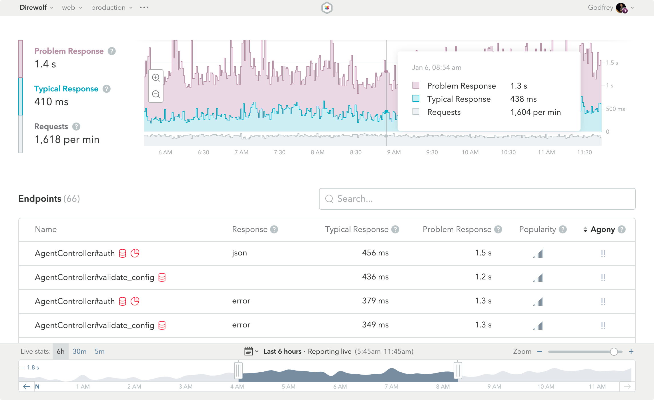
This is the App Dashboard, the first thing you’ll see when you log into Skylight. The dashboard gives you a high-level view of how your app is performing and acts as a starting point for digging into the details.
Response Timeline
At the top of the App Dashboard, you will see a graph with the "typical" and "problem" response times and requests per minute (RPM) for your app during the currently selected time range. Hover over the graph to see the specific numbers at a given time.
The Response Timeline is useful for keeping an eye on your application and making sure the response times don’t shoot up suddenly, and for detecting spikes in traffic.
Deploy Tracking
![]()
Skylight’s deploy tracking feature allows you to zero in on performance improvements or regressions caused by a deployment. With the deploy tracking feature configured, each of your deployments will be marked on the Response Timeline. Hover over the deploy icon to see information about that deploy. Depending on your configuration, you will see the deploy id, the git sha of the commit you deployed, and a deploy description.
Multiple deploys in a short timespan will be combined into one icon, with the deploy count indicated next to the icon. You can click on the deploy info popover to see a modal with deploy info for all deploys in that timespan. As you zoom in, the collapsed deploys will expand.
Endpoints List

Below the timeline is the Endpoints List. This list shows you all of the endpoints in your application that have been used in the currently selected time range; that is, all of the controllers and their actions.
In addition to each endpoint’s name, we display the Response type, the Typical Response and Problem Response times, Popularity, and Agony, as well as "heads up" icons to alert you to potential code mistakes that could cause slowdowns in your app.
Once you’ve figured out where you’d like to focus your performance-tuning efforts, just click on the endpoint name and you’ll be taken to a wonderland of performance information.
Popularity
Skylight allows you to view your endpoints based on how popular they are. The popularity of an endpoint is determined by the total number of requests per minute (RPM) it received. On the endpoints page, you can hover over a specific endpoints popularity to see its exact RPM during the selected time range.
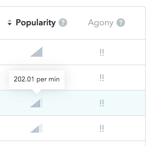
The more bars an endpoint’s popularity has, the more requests it received. We recommend sorting by popularity when trying to determine which endpoints have the most requests per minute. This can be particularly useful if you are trying to troubleshoot an uptick in requests.
Agony!!!
You may have noticed that by default, we order endpoints by our patent-pending Agony-Detection Algorithm™. (Just kidding about the patent-pending bit.) We calculate how much agony your endpoint is causing customers by looking at response times and endpoint popularity. Using a combination of these factors, we determine which endpoint is having the most adverse affect on your users.
Pro Tip:
To achieve the biggest gains in overall app performance, focus on improving your most agonizing endpoints. For example, you might have one endpoint that has a problem response time of 800ms (not too bad!), but receives hundreds of requests per minute. You may have another endpoint with a problem response time of 2 seconds, but that only gets hit once or twice a day. Obviously, it is probably better for business if you focused on the response time of the popular endpoint, rather than spending precious engineering time on the admittedly-slower-but-less-used endpoint.
Sorting
Of course, we also allow you to sort the list by any of the other columns. Just click on the column name to re-sort. If you ever forget what a column signifies, hover over the column header. We recommend you sort by Agony, though, and start at the top and work your way down.
Response Types
Skylight separates html, json, and errors into their own endpoints so you get a clear picture of each. Learn more about response types in our blog post.
Heads Up
Skylight notifies you of potential code mistakes that may slow down your app.

Repeated SQL Queries: In general, you will get better performance out of your database if you group similar queries together. Skylight identifies endpoints and events that repeatedly make similar SQL queries so that you can group them.

Allocation Hogs: We call out endpoints with abnormally high allocations that could be causing issues for your application. You can then drill into the individual endpoint and see exactly where the allocations occur so that you can optimize them.
Endpoint Search
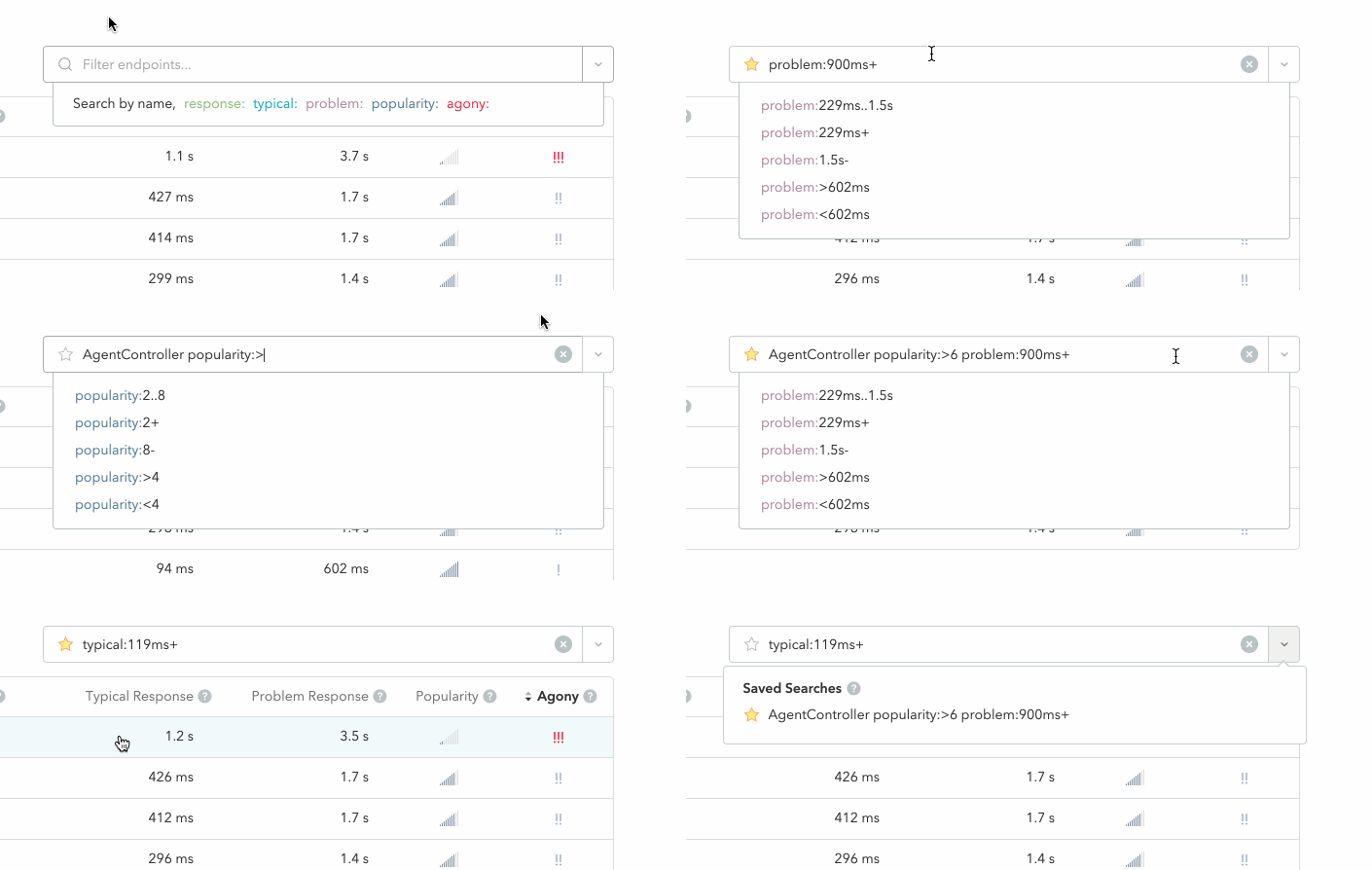
With Endpoint Search, you can search for a particular endpoint or group of endpoints by typing all or part of an endpoint name into the field; a type of fuzzy search. You can also filter based on the Endpoints List column headings.
Saved Searches
Skylight allows you to bookmark your commonly used Endpoint Searches for all users of an app. To save a search, simply type your query into the Endpoint Search input and click on the clear star button that appears. A yellow star indicates that a search has already been saved, and can be clicked on to remove it.
You can view an app’s list of Saved Searches by clicking on the dropdown button on the right-hand side of the Endpoint Search input. Clicking on an item in the dropdown will add it to the input to filter the Endpoints List and clicking on the yellow star to the left of the item will remove it from the list.
Note that all Saved Searches are specific to an environment (e.g. “development” or “production”) and a component (e.g. “web” or "worker"). Because Saved Searches are stored in this way, you can use them to track your work for each combination of environment and component in your app. This feature also makes it easy to share your work with colleagues, whether for getting help or demoing your performance improvements.
Grades (in Beta)
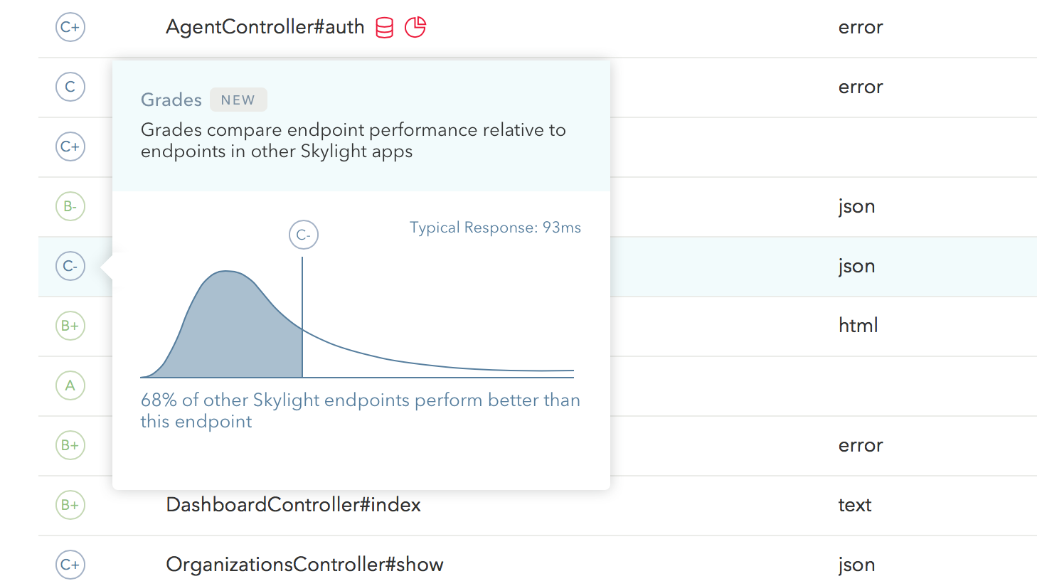
Our new Grades beta feature gives you perspective on the performance of your endpoints, relative to other Skylight apps, so you can focus on meeting your customers’ expectations. Learn more about Grades in our introduction blog post.
Navigating Your Endpoint
Endpoint View
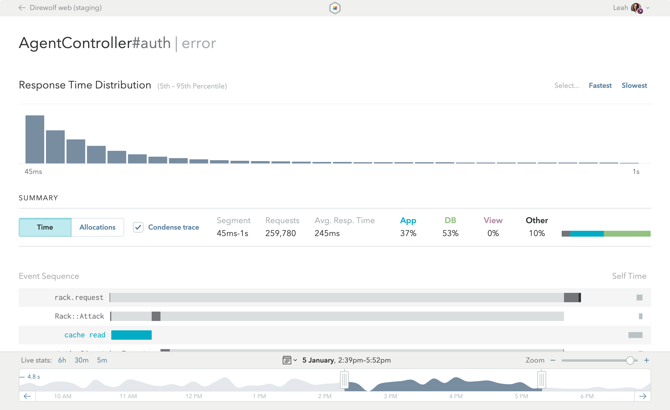
The Endpoint View is the heart and soul of Skylight. More than just looking pretty, this page is the end result of distilling thousands of data points into actionable information that you can use to speed up your app.
Response Time Distribution

At the top of the Endpoint View is the Response Time Distribution, showing you the distribution of the response times for this particular endpoint during the currently selected time range. The Endpoint View, by default, shows all of the requests in the selected time range. Often, it’s helpful to focus on slower requests to see exactly why they are so slow. You can filter the endpoint data by selecting just part of the histogram to zero in on problematic requests.
Pro Tip:
This Response Time Distribution is awesome because it makes bi-model distributions obvious. For example, imagine you are doing an additional SQL query when the logged in user is an admin. That particular query happens to be for a column that is not indexed, so it is very slow. If all you had was an average, you’d have no idea this was happening. But because you have a histogram, you can see that the fast, non-admin requests cluster around one response time, and the slower, admin-only requests cluster around another time.
Selection Summary

Once you’ve selected a target time range and grouping of response times, check out the Selection Summary. Here, you can toggle between Time or Allocations modes. You can also condense or uncondense the trace shown in the Event Sequence.
The Summary gives you an overview of the currently selected requests, including:
- The currently selected Segment of the Response Time Distribution.
- The total number of Requests.
- The Average Response Time or Average Allocations.
In addition, the Summary shows the types of events that make up the selected requests, broken down in terms of percentage of average response time or percentage of average allocations.
Event Sequence
The heart of the Endpoint View is the Event Sequence—also referred to as the “trace”—which shows you exactly where your app is spending time or allocating objects when servicing an endpoint. Each row represents a different event, and they’re color coded:
- Blue rows represent application code.
- Green rows represent database queries. Queries with the red database repetition symbol are generating repeated queries.
- Purple rows represent view generation. When these rows get long, caching may help you speed up your app.
- Black segments represent garbage collection. Because GC can happen sporadically throughout the request, we aggregate it and show it at the end.
- Grey rows capture other events that are not represented by the other colors. Frequently, this means synchronous HTTP requests.
When looking at an endpoint with the high object allocations heads up, be sure to switch to Allocations Mode. In this mode, the same trace will be re-scaled based on the number of allocations during each event, allowing you to quickly identify potentially problematic events (i.e. the largest bars in your traces), helping you to pinpoint your allocation hogs.
Request Aggregation
It’s important to understand that the Event Sequence does not represent a single request. It represents many (potentially thousands) of requests all merged into one. Showing single requests can send you on a wild goose chase, because that request may not be representative. Because we aggregate all requests together, if something looks like it’s taking a lot of time in the Event Sequence, that means it was taking enough time in your production environment to be statistically significant.
Detail Cards and Aggregated SQL Queries
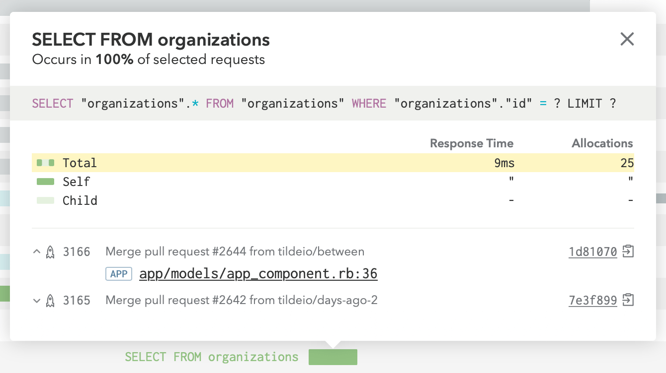
You can get more information about a particular event by clicking on it to get the Detail Card. In database events, for example, we show the SQL that was executed, so it’s easy to track down exactly what query was slow. Note that the SQL query is aggregated. Any variables are stripped from SQL queries before they are sent to Skylight, allowing us to aggregate similar queries and give you a more holistic view of the performance of the query (not to mention the information security benefits).
Self Time and Child Events
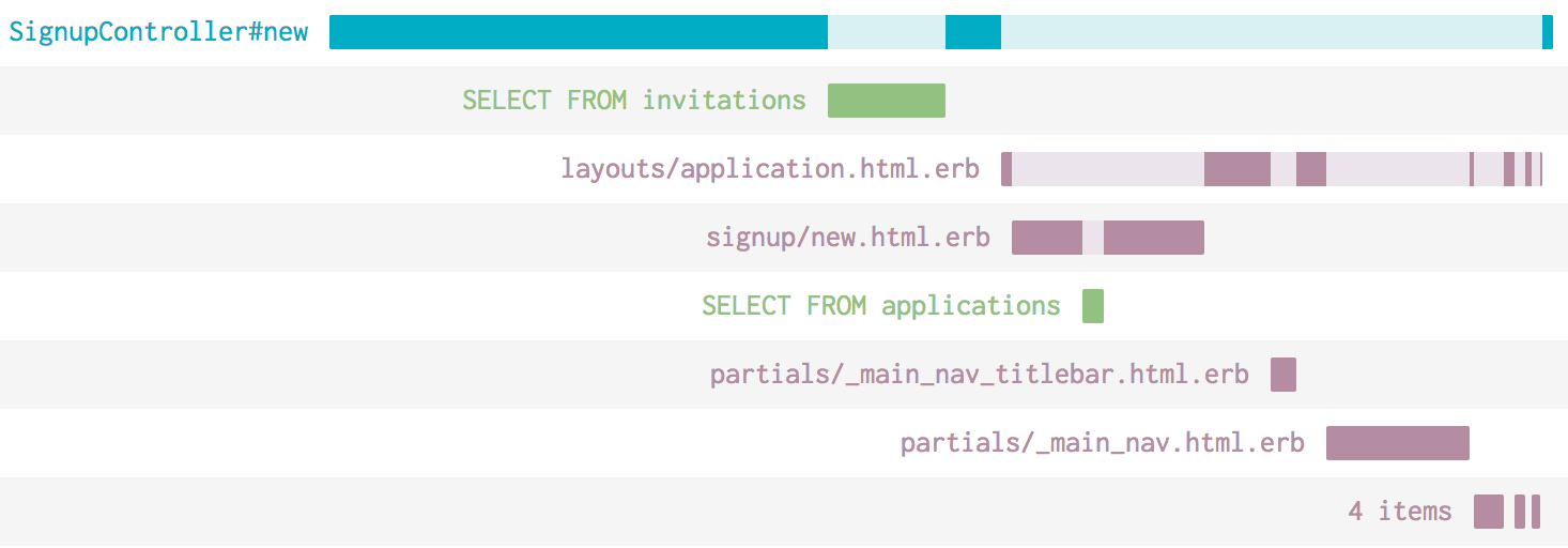
Wondering what the light and darker segments mean? If you see a dark segment, that’s “self-time”—time that was spent for that particular event. The total self-time for a row is shown at the end of the row.
Light colored segments represent child events. For example, if your controller’s Ruby code calls out to the database and then does something with that data, the time spent calling out to the database would be represented as a lighter shade of blue. You’ll see that the lighter shaded segments always line up with a child segment that appears below.
Uncondensing the Event Sequence
In order to minimize the amount of noise in the Event Sequence, Skylight shows it as “condensed” by default. Events with no children that have a very brief total duration are either condensed into a single line or hidden from view. You can uncondense the Event Sequence by unchecking “condense trace” in the Summary.
Navigating Through Time
Time Explorer

The time explorer lives at the bottom of your app views. For both the App Dashboard and the Endpoint View the data shown is for the range selected in the explorer. Displayed in the graph is the problem response time for either the entire application or for the specific endpoint being viewed.
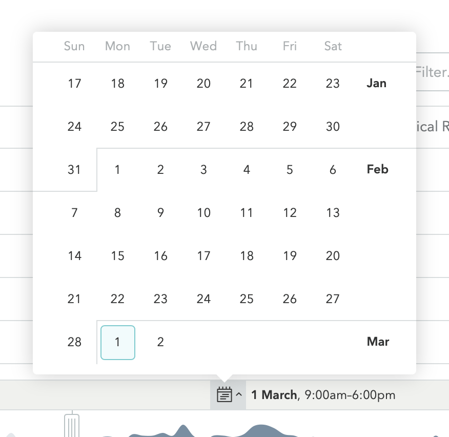
You can drag the selected range, use the arrows buttons, choose a predefined range of time or select one of the last 45 days using the datepicker. When you update this range, you’ll immediately see the current data in the rest of the page update accordingly.
Datepicker

Click the calendar icon to open a 45-day datepicker, then click a date to view it.
Live Mode
Live Mode allows you to view live data (updated once per minute) for any current time frames by selecting a “Live Stats” option on the left-hand side of the Time Explorer:

Pro Tip:
Click the timestamp of a live-mode selection to freeze it. This will turn off auto-reloading and update the URL to the exact time range.
Pro Tip:
To switch out of Live Mode, click the timestamp in parentheses. This will freeze the time explorer to the selected time range and update your URL to a shareable permalink.
Staying the Course
Trends
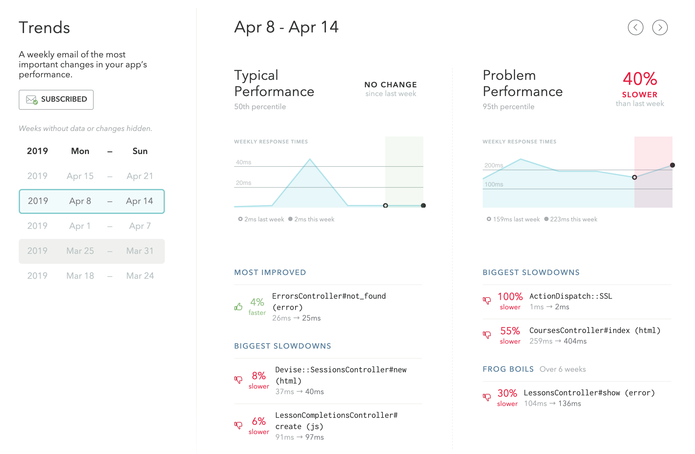
Our trends feature distills your performance data into a weekly report that helps you catch slowdowns before your customers do.
Track "typical" and "problem" response times with lists of your most improved endpoints your biggest slowdowns. Endpoints that have slowly declined over a 6 week period will be called out as “Frog Boils”.
Sign up for Trends Emails on your account settings page to get your trends reports sent your inbox. (Your historical trends data is also available for you to view on your Skylight dashboard without having to dig through your inbox!)